
Phonebook
Labels: product
iPhone app developer Takayuki Fukatsu (TiltShift Generator, Toy Camera) has helped produce a new project that brings together a print book and an iPhone, in a hybrid they call PhoneBook. (I know, I know..)
This book can be purchased from Amazon Japan, and sells for 3,000 yen.
Yes, we now can actually have kids.
Depths Of Philanthropic Visualizers
A lot of times, treasure is found just stored somewhere amongst the midst of websites of graphic designers who aren't shouting for your attention or the riding the waves of capitalism. Tourist Magazine was just a stumble-upon I had one weekend, while predominantly occupied in clicking link after link, site after site, via tumblr. Check out the articles, some of these aesthetically mesmerizing, visually entailing photos+videos take you to places even deeper in the ever-growing cyber universe of art and design. Labels: Publication, site


Wish Item #1
Labels: typography, Wish list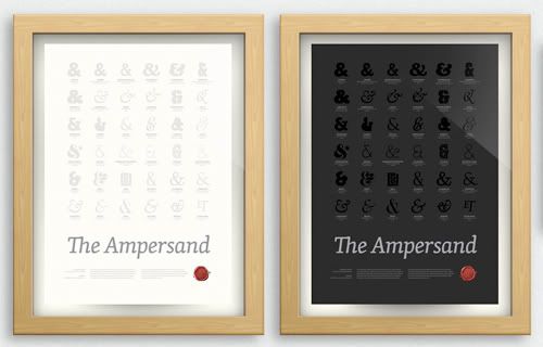
Child's Play
Grycia's Erde simple chair is multi-functional on different angles. They remind me of Jenga blocks - the game that teases gravity. To defy or double their original purpose, I used to build structures with them. They were nothing on their own but majestic when put together. Labels: product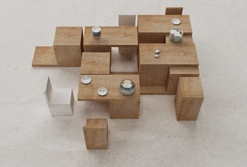
Frayn Yong's use of Graphite Lead creates architectural shapes that are close to my heart. I've always tried to reach the top of a spiderweb.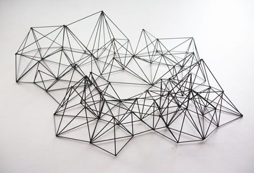
Enzo Mari's Sedici Animali and Sedici Pesci wooden puzzle challenges the child with uneasy forms, providing limitations that stretches the imaginations of children. He was interviewed in Apartamento #4, where he mentioned, "I wanted my toys to be freeing, not limiting, without putting dampers on the possibilities of play."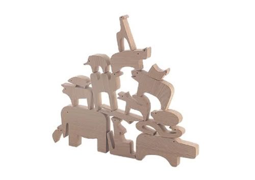
Sonia Rykiel Fall Winter 09/10
"I stole my boyfriend's jacket, and I will never give it back."
Sometimes we act a certain way to suit the personalities of our clothing which is why people would pay 100 bucks for a tee-shirt even if it looked like shit. In this case it is about how it makes you feel. Ok, so I admit watching this video to listen to Sasha Pivovarova's voice. But it sure proved to be 8 minutes well spent- a fashion show less on the glamour, more on its garments. The often annoying intention to wow us audience (unfortunately many often successful) is absent. If you have not heard your jacket tell you bedtime stories or rompers wishing they were less confused...
Anyway, notice how the setting looks unfinished, impromptu even but who cares when everyone looks like they are having a great time?
Hiatus
Sorry for the little updates. been trying to think of how to bring this site forward. It's been quite a ride, getting new jobs, managing our own finances, national service (for the guys) and graduation. I'm kinda sure we're over our heads with work. That's why the first thing to go was inevitably this site. Pretty much so that I've been wondering if it'll be a good idea to just close down this entire thing. I mean come on, there are TONS of other sites like ourpermanence, featuring many many many artists, and wonderful blogs with better css/html than ours. So how do we make this a special place? Labels: updates
As we graduate from our tertiary school lives, so has our schedules and pockets tightened. Maybe a little happiness coming our way is an art exhibition Steph, me and many of our friends are involved in. It's not going to be a great huge event, but something small for us graphic designers to appreciate the fundamentals of print medium. Righhttt here.
Adversities aside, ourpermanence will now go on a hiatus. I'm sure once in awhile, I'll be posting, but who knows? We'll be back full force some time soon, hopefully with some better way of showing information. And CSS. YES. Proper CSS.
Regards,
Sy
Concentration
Labels: graphic design, typography

I wouldn't mind this as an annual gift.
Atelierdorp, a design family
Labels: Architecture, graphic design, product
Atelierdorp is located in an abandoned church in the city of Eindhoven. Founded 3 years ago by Otje Bastiaanse, Hilbert Tjalkens, Djim Berger, Rocco Verdult and Vera Teunen with the aim to offer space for designers to grow. Over the years the church has developed into more then just simply a space for designers, it has evolved into a design family where people get a chance to explore their true creative potential. Currently designers in the church are working new works for Droog Design, Rossana Orlandi, Art Basel, ICFF and the Salone di Mobile in Milan amongst others. People like Bas van Raay, Nacho Carbonell, Julien Carretero, Ontwerpduo, Djim Berger, Joni Neelen, Veronique Lorne, Vera Teunen, Hilbert Tjalkens are proud to call it their working home. Music courtesy of NVIN: www.visuaal.com More info on Atelierdorp at www.atelierdorp.nl
Fireflies
Labels: photography


These are fireflies at night.
Citroën Karin
Labels: product
Citroën Karin is a concept car designed Trevor Fiore in 1980. It reeks of Creative Director, no?
from the amazing http://www.todayandtomorrow.net